Showing posts with label r-language. Show all posts

Friday, July 05, 2013

Bayesian Network Inference with R and bnlearn


The Web Intelligence and Big Data course at Coursera had a section on Bayesian Networks. The associated programming assignment was to answer a couple of questions about a fairly well-known (in retrospect) Bayesian network called "asia" or "chest clinic". The approach illustrated in the course was to use SQL, which worked great, but I wanted to see if I could also do it using Python or R.

I did look at Python first, but I was looking for a package which was mature and well-documented, and I couldn't find one (suggestions welcome). In the R world, I found gRain and bnlearn. gRain looked promising initially, although the installation was somewhat dodgy. However, I found later that the version I had wouldn't let me apply evidence, ie setFinding() or setEvidence() seemed to have no effect, so I ditched it in favor of bnlearn.

The network is shown below. Each node in the network corresponds to a particular event and has probabilities associated with it. This is an example of a Bayesian Network that has built based on probabilities assigned by domain experts. You can read more about the asia network and Bayesian networks in general here.


The code below defines this network to bnlearn, and then applies constraints (or evidence) to the network to get the probabilities of the three diseases Tuberculosis (T), Lung Cancer (L) and Bronchitis (B).

1
 2
 3
 4
 5
 6
 7
 8
 9
10
11
12
13
14
15
16
17
18
19
20
21
22
23
24
25
26
27
28
29
30
31
32
33
34
35
36
37
38
39
40
41
42
43
44
45
46
47
48
49
50
51
52
53
54
55
56
57
58
59
60
61
62
63
64
65
66
67
68
69
70
71
library(bnlearn)

set.seed(42)

# a BN using expert knowledge
net <- model2network("[A][S][T|A][L|S][B|S][E|T:L][X|E][D|B:E]")
yn <- c("yes", "no")
cptA <- matrix(c(0.01, 0.99), ncol=2, dimnames=list(NULL, yn))
cptS <- matrix(c(0.5, 0.5), ncol=2, dimnames=list(NULL, yn))
cptT <- matrix(c(0.05, 0.95, 0.01, 0.99), 
               ncol=2, dimnames=list("T"=yn, "A"=yn))
cptL <- matrix(c(0.1, 0.9, 0.01, 0.99), 
               ncol=2, dimnames=list("L"=yn, "S"=yn))
cptB <- matrix(c(0.6, 0.4, 0.3, 0.7), 
               ncol=2, dimnames=list("B"=yn, "S"=yn))
# cptE and cptD are 3-d matrices, which don't exist in R, so
# need to build these manually as below.
cptE <- c(1.0, 0.0, 1.0, 0.0, 1.0, 0.0, 0.0, 1.0)
dim(cptE) <- c(2, 2, 2)
dimnames(cptE) <- list("E"=yn, "L"=yn, "T"=yn)
cptX <- matrix(c(0.98, 0.02, 0.05, 0.95), 
               ncol=2, dimnames=list("X"=yn, "E"=yn))
cptD <- c(0.9, 0.1, 0.7, 0.3, 0.8, 0.2, 0.1, 0.9)
dim(cptD) <- c(2, 2, 2)
dimnames(cptD) <- list("D"=yn, "E"=yn, "B"=yn)
net.disc <- custom.fit(net, dist=list(A=cptA, S=cptS, T=cptT, L=cptL, 
                                      B=cptB, E=cptE, X=cptX, D=cptD))

# Unit test: Given no evidence, the chances of tuberculosis is about 1%
cpquery(net.disc, (T=="yes"), TRUE)
cpquery(net.disc, (L=="yes"), TRUE)
cpquery(net.disc, (B=="yes"), TRUE)
# [1] 0.01084444
# [1] 0.05428889
# [1] 0.4501667

# Question 1:
# Patient has recently visited Asia and does not smoke. Which is most
# likely?
# (a) the patient is more likely to have tuberculosis then anything else.
# (b) the chance that the patient has lung cancer is higher than he/she 
#     having tuberculosis
# (c) the patient is more likely to have bronchitis then anything else
# (d) the chance that the patient has tuberculosis is higher than he/she 
#     having bronchitis
cpquery(net.disc, (T=="yes"), (A=="yes" & S=="no"))
cpquery(net.disc, (L=="yes"), (A=="yes" & S=="no"))
cpquery(net.disc, (B=="yes"), (A=="yes" & S=="no"))
# [1] 0.04988124
# [1] 0.00462963
# [1] 0.316092
# shows that (c) is correct.

# Question 2
# The patient has recently visited Asia, does not smoke, is not 
# complaining of dyspnoea, but his/her x-ray shows a positive shadow
# (a) the patient most likely has tuberculosis, but lung cancer is 
#     almost equally likely
# (b) the patient most likely has tuberculosis as compared to any of 
#     the other choices
# (c) the patient most likely has bronchitis, and tuberculosis is 
#     almost equally likely
# (d) the patient most likely has tuberculosis, but bronchitis is 
#     almost equally likely
cpquery(net.disc, (T=="yes"), (A=="yes" & S=="no" & D=="no" & X=="yes"))
cpquery(net.disc, (L=="yes"), (A=="yes" & S=="no" & D=="no" & X=="yes"))
cpquery(net.disc, (B=="yes"), (A=="yes" & S=="no" & D=="no" & X=="yes"))
# [1] 0.2307692
# [1] 0.04166667
# [1] 0.2105263
# shows that (d) is correct

We then try to build the network from data, which is probably going to be the more common case. The bnlearn package contains the "asia" dataset, which we load as follows, then build a network and ask the same questions of it. It turns out that the answers are the same as the one built by domain experts.

1
 2
 3
 4
 5
 6
 7
 8
 9
10
11
12
13
14
15
16
17
18
19
20
21
22
23
24
25
26
27
28
29
30
31
32
33
34
35
36
37
# same BN using data
data(asia)
head(asia)
#    A   S   T  L   B   E   X   D
# 1 no yes  no no yes  no  no yes
# 2 no yes  no no  no  no  no  no
# 3 no  no yes no  no yes yes yes
# 4 no  no  no no yes  no  no yes
# 5 no  no  no no  no  no  no yes
# 6 no yes  no no  no  no  no yes

net.data <- bn.fit(hc(asia), asia)

# unit test
cpquery(net.data, (T=="yes"), TRUE)
cpquery(net.data, (L=="yes"), TRUE)
cpquery(net.data, (B=="yes"), TRUE)
# [1] 0.008564706
# [1] 0.066
# [1] 0.5077882

# question 1
cpquery(net.data, (T=="yes"), (A=="yes" & S=="no"))
cpquery(net.data, (L=="yes"), (A=="yes" & S=="no"))
cpquery(net.data, (B=="yes"), (A=="yes" & S=="no"))
# [1] 0.01630435
# [1] 0.02752294
# [1] 0.2978723
# still shows (c) is correct.

cpquery(net.data, (T=="yes"), (A=="yes" & S=="no" & D=="no" & X=="yes"))
cpquery(net.data, (L=="yes"), (A=="yes" & S=="no" & D=="no" & X=="yes"))
cpquery(net.data, (B=="yes"), (A=="yes" & S=="no" & D=="no" & X=="yes"))
# [1] 0.1
# [1] 0
# [1] 0.1666667
# still shows (d) is correct.

One thing I noticed is that if you make the same cpquery call twice in a row you get different answers. From what I understand about Bayesian Networks, I don't think this should happen. I am not very familiar with the R ecosystem, I couldn't find the appropriate R mailing list to ask about this, very likely I don't know where to look (if you do please let me know).

In case you need it, all the code in this post, as well as the SQL+Python based one I wrote for the original assignment, is available on my github page for this project.

Sunday, June 30, 2013

Better Bird Strike Visualizations with R and ggplot2


Last week I wrote about building some graphs for the FAA Bird Strike Dataset. I used R's built-in graphics capabilities for that work. In this post, I re-do the graphs using the ggplot2 plotting system for R. Why? Because ggplot2 builds upon the features and capabilities of the previous two graphics systems, base and lattice, and improves upon them. It seems to be the graphics system of choice if you are doing any serious R. So in any case, something I thought was worth learning, so I did.

In the interests of time, I will skip over the back story behind the graphs, since I already covered them in depth on my previous post.

The first graph displays the frequency of bird strikes for each of the states in the US in the form of a map. It makes use of a column called Origin.State in the Bird Strike dataset. Here is the code:

1
 2
 3
 4
 5
 6
 7
 8
 9
10
11
12
13
14
15
16
17
18
19
20
21
22
23
24
25
26
27
28
29
30
31
setwd("/path/to/project")

df <- read.csv("BirdStrikes.csv")
df.clean <- df[df$Origin.State != "N/A", ]

library(maps)
library(ggplot2)
library(RColorBrewer)

usa.map <- map_data("state")

# produce a data frame (region, val) where region is the 
# lowercased state name and val is the number of bird hits.
# We want to merge it with usa.map$region
hits.by.state <- as.data.frame(table(df.clean$Origin.State))
names(hits.by.state) <- c("region", "val")
total.hits <- sum(hits.by.state$val)
hits.by.state$region <- tolower(hits.by.state$region)

# merge the bird strike data in
usa.map.with.hits <- merge(usa.map, hits.by.state, by="region", all=TRUE)
usa.map.with.hits <- usa.map.with.hits[order(usa.map.with.hits$order), ]

# plot the data
colors <- brewer.pal(9, "Reds")
(qplot(long, lat, data=usa.map.with.hits, geom="polygon", 
       group=group, fill=val)) +
  theme_bw() +
  labs(title="States by Strike Count", x="", y="", fill="") + 
  scale_fill_gradient(low=colors[1], high=colors[9]) +
  theme(legend.position="bottom", legend.direction="horizontal")

And the graph generated looks like this:


The second graph shows the total cost of the impact by state. In an effort to pack in more information, we use a color gradient to indicate the number of bird hits for each state. So we combine the second and third graphs from the previous post into one here. We also flipped the graph to make it horizontal, that way its also easier to read. Here is the code:

1
 2
 3
 4
 5
 6
 7
 8
 9
10
11
12
13
14
15
16
17
18
19
20
21
22
23
24
25
26
27
28
29
30
31
32
library(ggplot2)
library(RColorBrewer)

# We want to produce a single bar plot where each state is represented
# by a bar. The color of the bar indicates the number of bird hits and
# the length of the bar indicates the cost incurred as a result
strikes <- as.data.frame(table(df.clean$Origin.State))
names(strikes) <- c("state", "num_hits")
costs <- as.data.frame(aggregate(
  as.numeric(Cost..Total..) ~ Origin.State, data=df.clean, FUN="sum"))
names(costs) <- c("state", "cost")
comb.strikes.costs <- merge(strikes, costs, all=TRUE)
comb.strikes.costs <- comb.strikes.costs[
  rev(order(comb.strikes.costs$cost)), ]

# clean up N/A from merged data, and add a state.level field for
# sorting by state name for ggplot. If we use state, ggplot will
# plot with the Alpha list of states, we want it sorted by cost
comb.strikes.costs <- comb.strikes.costs[
  comb.strikes.costs$state != "N/A", ]
comb.strikes.costs <- transform(comb.strikes.costs, 
                                state.level=reorder(state, cost))
comb.strikes.costs <- transform(comb.strikes.costs, 
                                hit.level=cut(num_hits, 9))

# plot the data
ggplot(comb.strikes.costs, aes(x=state.level, y=cost, colour=hit.level)) + 
  geom_bar(width=0.5, stat="identity") + 
  coord_flip() +
  labs(title="Costs by State", x="", y="(Dollars)", fill="") +
  scale_colour_brewer(palette="Reds") +
  theme(legend.position="none")

And our graph looks like this:


Our next graph draws the total bird strikes (ie, across all states) as a time series. The time dimension is given by the FlightDate column. We also compute a trend line using a linear model similar to the previous post and draw it on the graph. Here is the code:

1
 2
 3
 4
 5
 6
 7
 8
 9
10
11
12
13
14
15
16
17
18
19
20
library(ggplot2)
library(RColorBrewer)

# draw line chart of number of bird hits by flight date.
# Convert flight date to Date so we can sort
hit.dates <- as.data.frame(table(df$FlightDate))
names(hit.dates) <- c("flight_date", "num_hits")
hit.dates$flight_date <- as.Date(hit.dates$flight_date, 
                                 format="%m/%d/%Y %H:%M")

# Compute trend line and plot
trend <- lm(hit.dates$num_hits ~ hit.dates$flight_date)
trend.coeffs <- as.array(coef(trend))

# graph the number of hits over date
ggplot(data=hit.dates, aes(x=flight_date, y=num_hits, group=1)) + 
  geom_line() +
  labs(title="Bird Strikes by Date", x="Flight Date", y="#-hits") +
  geom_abline(intercept=trend.coeffs[[1]], slope=trend.coeffs[[2]], 
              color="red", size=2)

And the output is the graph as shown below:


Finally, we want to graph the incidence of various effects as a result of the bird strikes. The effect is given by the Effect..Impact.to.flight column. It is a set of 6 category variables, out of which we discard "Null", "None" and "Other" since they don't appear interesting enough for our analysis. To keep the graph smooth, we rollup the numbers into monthly numbers. Here is the code:

1
 2
 3
 4
 5
 6
 7
 8
 9
10
11
12
13
14
15
16
17
18
19
20
21
22
23
24
25
26
27
28
29
30
31
32
33
34
35
36
37
38
39
40
41
42
43
44
45
46
47
library(ggplot2)
library(reshape2)
library(RColorBrewer)
library(scales)

# roll up flight dates to nearest month. We do this by replacing all
# flight dates to the first of the month, then computing the number
# of days since the epoch (1970-01-01).
df.clean$FlightDate <- as.numeric(as.Date(
  format(as.Date(df.clean$FlightDate, format="%m/%d/%Y %H:%M"), 
  "%Y-%m-01")) - as.Date("1970-01-01"))

# Populate a table whose rows are flight dates and whose columns
# are each category of bird strike impact.
flight.dates <- unique(df.clean$FlightDate)
flight.dates <- flight.dates[order(flight.dates)]
effects <- unique(df.clean$Effect..Impact.to.flight)

# build up the data frame for plotting.
plot.df <- data.frame()
for (flight.date in flight.dates) {
  df.filter <- df.clean[df.clean$FlightDate == flight.date, ]
  counts <- table(df.filter$Effect..Impact.to.flight)
  row <- c(flight.date)
  for (effect in effects) {
    if (nchar(effect) > 0) {
      effect.count <- counts[effect]
      row <- cbind(row, effect.count)
    }
  }
  plot.df <- rbind(plot.df, row)
}
names(plot.df) <- c("flight_date", "NO", "PL", "AT", "OT", "ES")

# graph the number of hits over date. We restrict it to (PL, AT, ES)
# because the others seem unimportant.
plot.df.melted <- melt(plot.df, 
  id="flight_date", measure=c("PL", "AT", "ES"))
# convert the number of days since epoch back to actual dates for 
# graphing
plot.df.melted$flight_date <- as.POSIXct(
  plot.df.melted$flight_date * 86400, origin="1970-01-01")
ggplot(plot.df.melted, 
  aes(x=flight_date, y=value, colour=variable)) +
  labs(title="Impact Types over Time", x="Flight Date", y="#-impacts") +
  theme(legend.position="bottom") +
  geom_line(stat="identity")

And the corresponding graph is shown below:


If you compare the graphics generated in this post to my previous post, I think you will agree that the graphs look nicer and more professional. You may also notice a slight improvement in the quality of the R code. Thats because with ggplot2, it is easier if you can convert your input set to a data frame, so you will probably find the current R code more structured and easier to understand. I also use a few built-in R functions that I didn't know existed before.

Sunday, June 23, 2013

Bird Strike Visualizations with R


One of the assignments at the Introduction to Data Science course at Coursera is to design visualizations using Tableau for the FAA Bird Strike dataset. One big problem (for me) is that Tableau is Windows only, and I have a Mac. So before I used my wife's Windows PC to complete the assignment, I decided to try doing the visualizations in R as a way to understand the data.

I have used R in two previous Coursera courses, namely Computing for Data Analysis and Data Analysis, but I don't get enough practice with R since I much prefer using Python. I guess part of the reason is my familiarity with Python, but I feel that Python as a language is more well-designed and easier to use than R. However, I have been meaning to start using R for a while, and this seemed to be a good opportunity, since graphics are easier with R than with Python+Matplotlib.

The data is provided as part of a Tableau workbook, so to extract the data, I downloaded Tableau on my wife's PC, load up the workbook and export the data to an Excel worksheet, which I then converted to a CSV file using Open Office on my Mac. Now we are ready to answer the questions posed.

How large is our data set?

1
2
df <- read.csv("/path/to/BirdStrikes.csv");
print(dim(df));

This tells us that our data has 10,000 rows and 30 columns. Note that this is a truncated version of the full Bird Strikes data. I could have downloaded the original from the website but it comes as an MS-Access database and I could not get Open Office to read it.

When strikes happen, from where do they originate?

Our data is US only, and we have a Origin.State field which contains the name of the state where the flight originated. For our visualization, we use a map of the USA with the states colored with blue shades to indicate the number of strikes flights originating from them get.

1
 2
 3
 4
 5
 6
 7
 8
 9
10
11
12
13
14
15
16
17
18
19
20
21
22
23
24
25
26
27
28
29
30
31
32
33
library(maps)
library(RColorBrewer)

bsdf <- as.data.frame(table(df.clean$Origin.State))
bsdf$Var1 = tolower(bsdf$Var1)
maxfreq <- max(bsdf$Freq)
usa <- map("state", fill=FALSE)

palette <- brewer.pal(9, "Blues")
name.idxs <- match.map(usa, bsdf$Var1, exact=FALSE)
print(name.idx)
freqs <- as.array(bsdf$Freq)
colors <- c()
for (i in 1:length(usa$names)) {
  stname <- strsplit(usa$names[i], ':')[[1]][1]
  freq <- bsdf[bsdf$Var1 == stname, ]$Freq
  if (length(freq) > 0) {
    col.idx <- round(9 * freq / maxfreq)
    if (col.idx == 0) col.idx = 1
    color <- palette[col.idx]
    colors <- cbind(colors, color)
    print(paste(usa$names[i], stname, freq, col.idx, color))
  } else {
    color <- palette[1]
    colors <- cbind(colors, color)
    print(paste(usa$names[i], stname, freq, col.idx, color))
  }
}
usa <- map("state", fill=TRUE, col=colors)
title("States by Strike Count")
leg.txt <- c("Low", "Avg", "High")
leg.cols <- c(palette[1], palette[5], palette[9])
legend("bottomright", horiz=FALSE, leg.txt, fill=leg.cols)

The image generated by the above code looks like this...


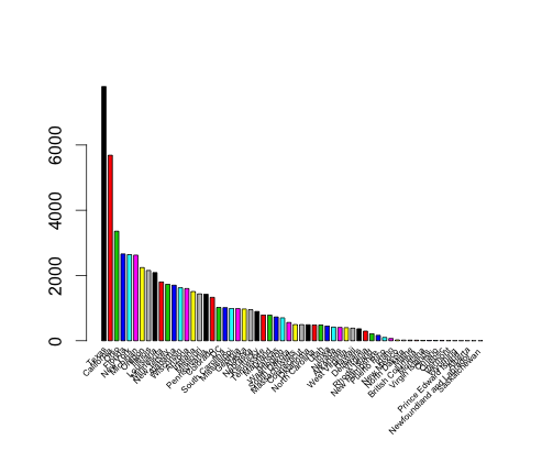
What are the top states in which strikes occur?

Although the shaded map is good for an instant look (and it tells me that my home state of California is the top state for bird strikes, followed by Texas, it does not give a quantiative feel for the data. For that we need a bar chart...

1
2
3
4
5
6
7
8
# calculate counts of bird hits by Origin.State and sort by count desc
bsdf <- as.data.frame(table(df.clean$Origin.State))
bsdf.sorted <- bsdf[with(bsdf, order(-Freq)), ]
bar <- barplot(height=bsdf.sorted$Freq, horiz=FALSE, beside=TRUE, 
               width=c(2,2), space=0.5, xaxt="n",
               col=palette())
text(bar, par("usr")[3], labels=bsdf.sorted$Var1, srt=45, 
     adj=c(1.1, 1.1), xpd=TRUE, cex=0.5)

As you can see, California still leads and Texas follows close behind, although the names of states are a bit hard to read, even with the 45 degree rotation.


We may also want to find out which states end up paying the most for these bird hits. For this we simply calculate the sum of costs (given by the Cost..Total.. column) by Origin.State.

1
 2
 3
 4
 5
 6
 7
 8
 9
10
# calculate sum of costs incurred by Origin.State and sort by cost desc
cidf <- aggregate(as.numeric(Cost..Total..) ~ Origin.State, 
                  data=df.clean, FUN="sum")
names(cidf) <- c("state", "cost")
cidf.sorted <- cidf[with(cidf, order(-cost)), ]
bar2 <- barplot(height=cidf.sorted$cost, horiz=FALSE, beside=TRUE,
                width=c(2,2), space=0.5, xaxt="n",
                col=palette())
text(bar2, par("usr")[3], labels=cidf.sorted$state, srt=45, 
     adj=c(1.1, 1.1), xpd=TRUE, cex=0.5)

and it turns out that Texas incurs the highest cost of bird hits...


Has there been a change in strikes over time?

We have data from January 2000 to August 2001, so we can draw a simple line chart to visualize the change of bird hits over time.

1
 2
 3
 4
 5
 6
 7
 8
 9
10
11
# find counts by flight date
fdds <- as.data.frame(table(df$FlightDate))
fdds$Var1 <- as.Date(fdds$Var1, format="%m/%d/%Y %H:%M")
fdds.sorted <- fdds[with(fdds, order(Var1)), ]
plot(fdds.sorted$Var1, fdds.sorted$Freq, type="l",
     xlab="Flight Date", ylab="Bird Strikes", 
     main="Bird Strikes (daily)")

# compute trend line and place
model <- lm(fdds.sorted$Freq ~ fdds.sorted$Var1)
abline(model, col="red", lwd=4)

This shows us a seasonal trend that peaks around fall each year, probably at around the time birds migrate south for the winter. As shown by the thick red line (fitted using a linear model), bird strikes appear to be trending upwards.


Use the "Effect: Impact to Flight" dimension to investigate.

Even though we know that the number of strikes are increasing, its not clear as to whether this is because we are getting better with reporting or if aviation safety is getting worse. In other words, how many of these strikes result in engine failure or some other serious effect? For this, we use the "Effect..Impact.to.flight" column. It has 6 categorical values, so our initial visualization is to do a scatter plot over time.

1
 2
 3
 4
 5
 6
 7
 8
 9
10
11
12
13
14
15
16
17
18
19
20
21
22
23
24
25
26
27
28
29
30
31
32
33
34
35
36
37
38
39
40
41
42
43
# preprocess and sort data by flight date
df$FlightDate <- as.numeric(
  as.Date(df$FlightDate, format="%m/%d/%Y %H:%M") -
  as.Date("1970-01-01", format="%Y-%m-%d"))
df$Effect..Impact.to.flight <- as.factor(df$Effect..Impact.to.flight)
df.sorted <- df[with(df, order(FlightDate)), ]
# find limits for graphing
ylim.min <- min(as.numeric(df.sorted$Effect..Impact.to.flight))
ylim.max <- max(as.numeric(df.sorted$Effect..Impact.to.flight))
xlim.min <- min(df$FlightDate)
xlim.max <- max(df$FlightDate)
xlim.cent <- (xlim.min + xlim.max) / 2
# colors for graphing
colors <- palette()
idf <- as.data.frame(table(df.sorted$Effect..Impact.to.flight))
i <- 1
leg.txt <- c()
leg.cols <- c()
for (impact.str in idf$Var1) {
  df.subset <- df.sorted[df.sorted$Effect..Impact.to.flight == impact.str, ]
  if (i == 1) {
    print(paste("in plot:", impact.str, colors[i]))
    plot(df.subset$FlightDate, 
         df.subset$Effect..Impact.to.flight, 
         col=colors[i], xaxt="n", yaxt="n",
         xlab="Time", ylab="Impact Type",
         ylim=c(ylim.min, ylim.max), xlim=c(xlim.min, xlim.max),
         main="Impact Types over Time")
  } else {
    print(paste("in line:", impact.str, colors[i]))
    points(df.subset$FlightDate, 
           df.subset$Effect..Impact.to.flight,
           col=colors[i])
  }
  leg.cols <- cbind(leg.cols, colors[i])
  leg.txt <- cbind(leg.txt, impact.str)
  i <- i + 1
}
x.at <- c(xlim.min, xlim.cent, xlim.max)
x.labels <- as.Date("1970-01-01") + x.at
axis(1, at=x.at, labels=x.labels, las=0)
axis(2, at=c(1,2,3,4,5,6), labels=c("UK", "AT", "ES", "NO", "OT", "PL"), 
     las=2, cex=0.5)

Of these, the UK (Unknown), NO (None) and OT (Other) values do not convey any information, except that they are perhaps too minor to document. The interesting categories are AT (Aborted Take-off) in red, ES (Engine shutdown) in green and PL (Precautionary Landing) in magenta. As we can see, Engine Shutdown cases are thankfully not too many to begin with and are actually becoming a thing of the past. Aborted Takeoffs are rising, but not as much as Precautionary Landings.


A better visualization is line charts. As before, we roll up the data into months for each impact type. We remove the Unknown, None and Other impact type values since they don't convey any useful information (and it messes up our scales as well :-)).

1
 2
 3
 4
 5
 6
 7
 8
 9
10
11
12
13
14
15
16
17
18
19
20
21
22
23
24
25
26
27
28
29
30
31
32
33
34
35
36
37
38
39
# roll up by YYYYMM, so we convert the FlightDate to that
df$FlightDate <- as.numeric(format(as.Date(df$FlightDate, 
                            format="%m/%d/%Y %H:%M"), "%Y%m"))
# subset and roll up counts for each impact type
impact.types <- as.data.frame(table(df$Effect..Impact.to.flight))
# we visually figure out the ymin and ymax values for all impact types
ylimits <- c(0, 60)
i <- 1
colors <- palette()
for (impact.type in impact.types$Var1) {
  if (nchar(impact.type) > 0 &
      impact.type != "None" &
      impact.type != "Other") {
    df.subset <- df[as.character(df$Effect..Impact.to.flight) == impact.type, ]
    df.count <- as.data.frame(table(df.subset$FlightDate))
    if (i == 1) {
      print(paste("in plot:", impact.type, colors[i], 
            min(df.count$Freq), max(df.count$Freq)))
      plot(as.numeric(df.count$Var1),
           df.count$Freq, type="l",
           col=colors[i], xaxt="n",
           xlab="Time", ylab="#-impacts",
           ylim=ylimits,
           main="Impact Types over Time")
    } else {
      print(paste("in line:", impact.type, colors[i], 
            min(df.count$Freq), max(df.count$Freq)))
      lines(as.numeric(df.count$Var1), 
            df.count$Freq,
            col=colors[i])
    }
    i <- i + 1
  }
}
x.at <- c(1, 20)
x.labels <- c("2000-01", "2001-08")
axis(1, at=x.at, labels=x.labels, las=0)
legend("topright", c("AT", "ES", "PL"), 
       fill=c(colors[1], colors[2], colors[3]), horiz=TRUE)

The resulting graph confirms our observation that Engine Shutdown is no longer an issue, and that Aborted Takeoff and Precautionary Landings are on the decline as well.


How does it compare to using Tableau?

Well, to give Tableau due credit, its very nice once you get the hang of it. I had trouble because I could not find the sidebar menu (which is needed to do almost anything, and which for reasons unknown was turned off by default - I had to go into the Windows tab and turn it on. Once I got that, I was able to complete the assignment - basically the answers to the questions posed above plus one question you had to think up for yourself and answer it - in under an hour. In comparison, doing the same thing in R took me approximately 5-6 hours (although I am guessing that number will decrease as I become more fluent with R).

That said, Tableau is neither free nor multi-platform. It runs only on Windows, although that may change to include Linux and Mac users in the future. Second, I was on a teaser (but fully functional) version. So you need to like it enough to want to (or cajole your employer to) pay for it. For the moment, I think I will stick with R.